Advanced Typography Task 3

25.10.2023 - .29.11.2023 / Week 09 - Week 14
Michael Chan Henn Loong / 0363611
Advanced Typography / BA of Design (HONS) in Creative Media / Taylor's University
Task 3 


LECTURES

Refer to Task 1


INSTRUCTION

Task 3: Type Exploration and Application

In Task 3 we are asked to either create a font that is intended to solve a bigger problem or explore the use of an existing letterform or we can have an experiment on a novel and unique font working with materials that might be 3 dimensional, digitally augmented, edible, unusual or even typographic music videos or fine art. 

1. Research and ideation

Fig 1.0 Research PPT for Task 3


2. Digitalization


Fig 2.0 Font reference

So this is the font that I'm referencing on Chiller. I chose this font because it's also used for horror theme and I felt that the font does look unique and unusual but I think it's not scary enough so I reworked on it.


Fig 2.1 Font Anatomy

I used this boxes to create my font anatomy.

Fig 2.2 Font Anatomy 2

So the final anatomy is like below:

Ascender : 800pt
Cap line : 750pt
Median line : 500pt
Baseline : 0pt
Descender : -150pt

Fig 2.3 Font following Anatomy


Fig 2.4  Font with Anatomy

This is how the fonts looks like following the anatomy. After finishing up all the letters I noticed that some of my letters would pass the ascenders a little bit due to it's design, if I shorten the letter down it would look fat and short so some letters like A,F,R,V would bypass the ascender a little bit.

Fig 2.5 Number 3 working process

The process of making number 3 is actually quite difficult for me as I wanted it to be more special and not just a typical normal number 3 so I tried for a few times and noticed that making the number 3 a little bit slanted would be nice.

Fig 2.6 Before and after applying effects


Fig 2.7 Letters next to each other

So after finishing up all the letters I put the capital and small letters beside each other to check the proportion and to check that whether the letters are inside the X-height.

3. Font Lab


Fig 3.0 All letters in Font Lab


Fig 3.1 Before and after kerning

This is the difference of the fonts before and after kerning, and throughout the process I noticed that the auto kerning function sometimes create a big gap between each letters, so it can't be trusted fully and we should do the kerning manually it would be easier to control it since the very start.

4. Font Presentation


Fig 4.0 Font presentation

This is the overall font presentation.

Fig 4.1 1st page, Font name

For the first page of the font presentation I just added in my Fonts name as it represents my font and I think it's a good start for it too.

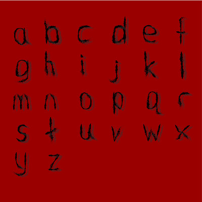
Fig 4.2 2nd page, Small letters

For the second page I inserted my small letters and I've also created a shadow effect at the back of the letters to make it more interesting.

Fig 4.3 3rd Page, Capital letters

The third page would be the capital letters, I used the same idea in my small letters I added in shadows at the back of my font so it feels more consistent and the reason I added in shadows is to add in the feeling of horror as my font is designed for horror theme.

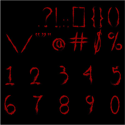
Fig 4.4 4th Page, Punctuations & numbers

For the fourth page I switched the background and the fonts color as I wanted to try out different perspectives, funnily it turns out to be fine, So I changed my first page to black background and red color for the fonts too, as it was originally dark green for the background at first after seeing the black background I felt that making it clean would be better rather then using the green background it doesn't really works that well compared to the back one.

Fig 4.5 5th Page

For this presentation I'm actually trying to make a tv glitching effect the idea actually came from the evil spirit Sadako Yamamura as the evil spirit originally comes out from the television, so I thought that the font can also be used in that way too.
 
Fig 4.6 6th Page, Dollar sign

The sixth page is actually my personal favorite it's one of the my favorite created fonts in this exercise, I like how sharp, slim and thin the S looks like and the end of the letter S looks cool too it kinds of represents blood spilling. When I'm doing this font I felt like the line crossing the letter S kind of express that horrifying stuff can happen because of money as the end kind of looks like blood spilling too.


5. Font Application 


Fig 5.0 Font application 

This is the overall Font application.

Fig 5.1 1st page, Incantation

This is the first page of the font application I chose this poster because of the hands in the middle it looks monstrous enough so I think my fonts can express the feeling here.

Fig 5.2 2nd page, Smile

As for the second page, I used the horror movie Smile's poster, I think the fonts can bring out the creepiness for this movie as the word smile is normally expressing positivity and the font can bring out the horrific vibes for this movie, with a positive yet evil word for this movie. I've also added in a sentence on the top to bring out the vibe.

Fig 5.3 3rd page, Evil Dead Rise

For the third page I used Evil Dead Rise, as for this poster why it's suitable because the movie itself uses a undead or possessed topic for this movie so it's pretty straight forward, the fonts itself already expresses a evil vibe so I think it can be used in this poster.

Fig 5.4 4th page, Incantation

As for fourth page, it's the same as the first one just that the image is different and the reason I increased the size of the T is due to the seal logo at the back, to make the tittle more involved in the poster. 
Fig 5.5 5th page, Slenderman

As for fifth page, it's my least favorite application, the fonts are actually designed firstly for this movie 'Slenderman' but after finishing the fonts and all I noticed that there are no suitable posters to apply my fonts. So I went to the trailer and took a screenshot and added in the title and also a sentence on the top left to try and bring out the feeling and vibes.

6. Final Submission


Fig 6.0 Final Font Presentation.


Fig 6.1 Final Font Application.


Fig 6.2 Font Installation

Font Download:
https://drive.google.com/file/d/1mXwKX4yhccRbKv6W2C1SAprqO7RKLcbk/view


FEEDBACK:

Week 14:
Final Submission.

Week 13:
---

Week 12:
---

Week 11: 
The small letters is not consistent it doesn't have the same vibes as the capital letters.
Some of the punctuations are not on the baseline and some are over the ascender & descender.
Choose the product for the presentation properly if not the font wont work.
Make sure there are still strokes in the original file if not it wont be possible to transfer the fonts into font lab.

Week 10:
Make sure the small letters like b and d are in the right proportion, make sure that it touches the median line and is in the x-height.

Week 9:
Find out what proposal am going to work with.
Make sure the fonts are following the baseline ascenders and descenders.


REFLECTION:

Experience:
Throughout this whole task I noticed that creating something you're interested in is actually quite fun, even though I'm sick for 2 weeks I still had fun creating the fonts. During the applying section I felt happy seeing my own fonts applied on the movie posters and when it's applied on something that I've experienced before it feels more fulfilling. This whole task is fun as we get to do what we want but in another way it's hard too as different students have different level of skills so some students excels in this task and some like myself might have a hard time throughout the task. Seeing my classmates work I felt that my work is pretty bad but it also pushed me to experiment more on my work and I'll try to reflect too so overall everything is great and with Mr. Vinod's help I get to go through the font creation section successfully.

Observation:
I noticed that creating a font doesn't needs to be specifically a theme that we like it can also be something that we like maybe like our pets or the games we play or even the movies we watch. For me I wasn't thinking much at the start of the task so throughout the process I noticed that there are more designs that I would like to do rather then the current font I'm working with. I came up with different ideas and different stuff's that I want to experiment with throughout the process but sadly I'm stuck with the current font. But still this task is fun. I noticed that I've also forgotten how to use font lab so I needed to go through the videos and do researches again so that I can use the app properly.

Findings:
I found out that everyone have very different perspective while creating their fonts and even with the same theme different students creates different kind of fonts that expresses different vibes.


FURTHER READING:


Fig 7.0 The art of computer game design.

Playing games require two major components 'game' and 'player'. So game designers works to produce games so their first task or main direction would be the game itself. Yet nowadays game designers requires to educate, entertain, or edify the game-player ; hence the primary concern of a game designer is the player itself. people always ask why play game, what is fun about game, what motivates you the answer to these questions would be good game design.

After reading the book I learned that the crucial parts are the gameplay, the sensory gratification and individual preferences. I've also learned that the UI/UX affects the experiences too. Like maybe the map or the colors would affect the experiences of different types of gamers. 

Gaming design have evolved throughout the years for an example in the 1950s - 70s most of the games are simple, text based games or pixelated games then slowly in the 1990s games starting to evolve into 3D most of the games starts to transition into 3D graphics and environment and its in the 90s designer starts to introduce 3D game design principles, such as leveling design and camera control movements in the game.


Comments

Popular posts from this blog

DESIGN RESEARCH METHODOLOGY - PROJECT 1 / RESEARCH PROPOSAL

Game Studies