Information Design - Project 1 & 2: Infographic Poster & Minimal animated Infographic
17.02.2025 - 10.03.2025 / Week 3 - Week 6
Michael Chan Henn Loong
0363611
Information Design / Bachelor of Design (Hons) in Creative Media
/ Taylor's University
Project 1 - Infographic Poster & Minimal
animated Infographic
INSTRUCTIONS
<iframe
src="https://drive.google.com/file/d/16W2RTf4OVfwH0-tjoR4ACl0n3XfN8cS_/preview"
width="640" height="480" allow="autoplay"></iframe>
PROJECT 1 - INFOGRAPHIC POSTER & MINIMAL ANIMATED INFOGRAPHIC
PART 1
So we got briefed in class that we need to look up for posters or infographics that are suitable for us to redesign. So I went and looked up for something that I myself am interested in the gaming field and movie field.

Fig 1.0, Game field Infographic
So this is the first one I got I think this poster looks boring and plain but the information are all there so I though it'd be a good option for me to redesign this poster.

Fig 1.1, Game field Infographic
As for this one I just thought that it looks very boring and the whole layout is filled with information so I thought that maybe I can reorganize it and maybe summarize up some of the information so that the poster doesn't look so cramped.

Fig 1.2, X-men Timeline infographic
I think this one is actually pretty organized and looks fun enough for me but there's only one thing off with it for me which is the information I think the way it's showing looks kinda complicated so I picked it as well.

Fig 1.3, Celluloid to CGI Infographic
As for this one I think the reason is pretty obvious the poster looks boring and plain too simple so I took this one as one of my potential target and after all the consultation, initially I chose this as my target for the redesign infographic poster because comparing to the other 3 I already have some ideas on how I'd like to redesign this poster.
So after confirming on which poster to work on I started with my sketches. I did a few sketches and I got some ideas that I think is fun to play with and experiment with but I'm not really sure whether the idea is going to work.

Fig 1.4, Sketch 1

Fig 1.5, Sketch 2
I actually think that this idea is way cooler than the previous sketch and I actually liked this one alot but I'm not sure am i capable of animating all that and also about the information part like does it need to be presented at the first point or can it be shown slowly one by one.

Fig 1.6, Sketch 3
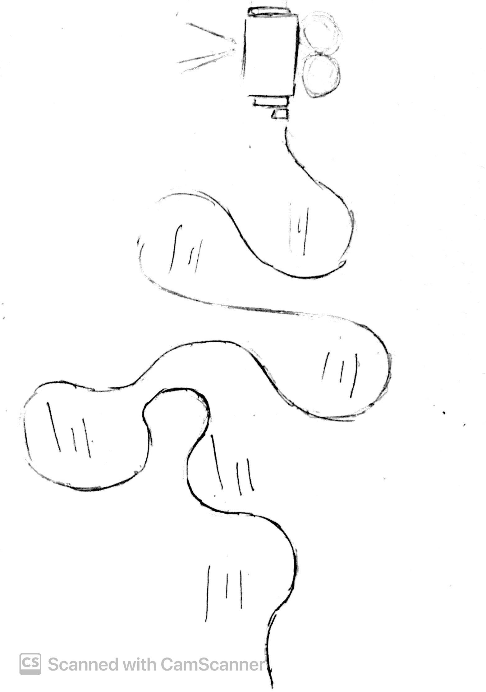
Fig 1.7, Sketch 4
As for these 2 its the first 2 ideas that I thought of when I had a first sight on the original poster which is to use the celluloid as a animation moving around the layout and have the information following their trails. But after I got other ideas they are not used anymore.

Fig 1.8, Sketch 1 prototype

Fig 1.9, Sketch 2 Prototype
So before the next class I created a rough visual of how the poster would look like and I planned to show Mr. Fauzi during the consultation session but throughout the consultation more and more of my questions are solved after listening to Mr. Fauzi explaining to the other students, so I didn't show my progress and I proceeded with creating something new because after a few thoughts I felt like doing something more minimalist and clean.
So I went to Pinterest and tried to look up for some minimalist yet fun infographic poster, and I got two poster on Pinterest and I also went and looked at Mr. Fauzi's work these 3 poster inspired me on creating my upcoming infographic poster.

Fig 2.0, Reference 1

Fig 2.1, Mr. Fauzi's Infographic Poster (Reference 2)

Fig 2.2, Reference 3
So after getting these 3 references I started to work on my layout again I like how the line in reference 3 is, the line itself can already represent the evolve of celluloid to CGI so I created a draft based on it and tried to fit in the information from the original poster.

Fig 2.3, Draft 1
But after fitting in the information I think it feels abit off and I think the layout is kinda bad so I went ahead and tried out something else different shapes of line different colors and layout.

Fig 2.4, Draft 2
And I got this as my result I think this one suits the theme better then the previous draft cause the color suits as well like the color kinda gives off vintage vibes as well so I'm satisfied with the color the line looks nice as well so all that is left is to fit the information into the empty spaces and maybe add on a few small doodles to make it more interesting.
So before I proceed with all that I thought of first choose the fonts that I will be using for this poster so I tried out a few and I think Showtime works the best it's a font I found online and it suits the theme pretty well the fonts that I've experimented with will be shown in Fig 2.5.
.png)
Fig 2.5, Font Choices
So as shown in Fig 2.5 I chose Showtime as my final font for the tittle and I used another font for the body texts. I used Lato for the body texts cause that fonts readability is high and it looks modern enough for me to have it represent the present vibe.
.png)
Fig 2.6, Art Assets
After deciding on what font to use I proceeded with creating the art assets that I will be needing for the final poster. I've also created some doodles like the sun, balloon, price tag and also trees to design the final poster so that it doesn't look that boring.

Fig 2.7, Draft 3
So this is the reason why I created some of the doodles, cause after I'm finished with this I stared at it with my dead eyes and I felt like damn this poster is boring, so I tried to add in some of the elements that I've created in the art assets.

Fig 2.8, Final Poster
After a few tweaks here and there and added in some of the doodles I did I felt like this poster is more lively now and its not too cramped and for me it's clean enough so I have this as my final Poster.
PART 2
So after I'm done with my poster I'm supposed to Animate my infographic poster into one static loop animation page, and the loop duration needs to be around 15sec - 30sec. The Size of the video will be 1080 x 1920 px (Vertical Video) and after I'm done with it I need to upload it to my own Youtube channel.
So I looked back to my infographic poster and I thought I should make something simple so that it doesn't complicate things as I want it to be as simple as possible.
So the first step I did was preparing and organizing all necessary visual elements. All the graphics and texts were exported as separate assets to ensure flexibility during the animation process. By structuring the design in layers, individual elements could be animated independently for greater control over the effects I want to create.
.png)
Fig 2.9, Separated Assets
So before jumping into animating, I planned out how things should move and appear on screen. I arranged everything in a way that made sense cause the size of the poster and the animation is different. Breaking it into small steps helped me stay focused and avoid making things feel too messy or rushed cause I'm not very familiar with animating stuff so it is pretty difficult for me.
.png)
Fig 3.0, Arranging the elements and frames
Here’s what I did to for the animation:
- Fading In and Out: I made elements slowly appear and disappear to make transitions smooth.
- Moving Along a Path: Some parts moved from one place to another in a controlled way.
- Some things grew or shrank slightly to add a sense of movement and focus.
- Looping Animations: A few elements kept moving in a repeating pattern to make the scene feel more alive.

Fig 3.1, Animation Gif
Once I was happy with the animation, I exported it as a MP4 and GIF so it could be used easily and also I can upload the MP4 to Youtube. I also made sure the file was the right size and quality for smooth playback.
Fig 3.2, Final Animation
Here's the link to the Youtube video of the Infographic animation poster: https://youtu.be/ZUe88REEKqI
REFLECTION
Looking back, this project was actually a really good learning experience for me. At first, I thought animation is very hard for me to do, but breaking it down into smaller steps made it much easier to manage. I also realized how important it is to test things out and make small adjustments to get the best results. Timing and movement really make a difference in making an animation feel smooth and natural. If I were to do this again, I would experiment more with different effects and maybe try more complex animations, as the ones I do now are only easing in and out as well as controlling the MS which are all very basic animations. Overall, I’m happy with what I created, and I feel that I might have more interest in animation now comparing to last time.


Comments
Post a Comment