Information Design Exercise 1 & 2
03.02.2025 - 10.02.2025 / Week 1 - Week 2
Michael Chan Henn Loong 0363611
Information Design / Bachelor of Design (Hons) in Creative Media / Taylor's University
Exercise 1


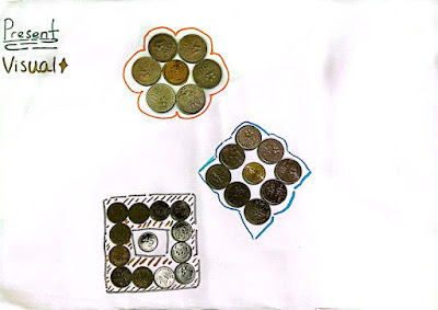
So in this visual I'm trying to create a flower the top one and the middle one
would be a diamond and third one is actually a treasure box, why did I make it
this way ? Even I'm not sure of it but these ideas just came to my head so I
just kinda try to mimic their appearance I guess. I only wanted to make a flower
at first cause of the Hibiscus I saw on the coins but then slowly the idea of
the shard came in then the treasure box.


.png)

.png)
.png)
.png)
.png)
.png)
.png)
.png)

Michael Chan Henn Loong 0363611
Information Design / Bachelor of Design (Hons) in Creative Media / Taylor's University
Exercise 1
INSTRUCTIONS
<iframe
src="https://drive.google.com/file/d/16W2RTf4OVfwH0-tjoR4ACl0n3XfN8cS_/preview"
width="640" height="480" allow="autoplay"></iframe>
EXERCISE 1 - Quantify & Visualize Data
So in this exercise we are tasked to quantify our objects and arrange them
into a presentable order or layout. So I chose coins as my object.

Fig 1.0, Chosen Object
After taking out the amount of coins I will be using for this exercise I
started to follow the steps that are provided by Mr. Fauzi in class, Data -
Sorted - Arranged - Presented Visually and Explained with a story.

Fig 1.1, Data
So I started sorting the coins into their own values like 50sens, 20sens,
10sens and 5sens.

Fig 1.2, Sorted
After the sorted section I thought of stacking up the coins by their value and
color for the arranged as it all looks more tidy and organized.

Fig 1.3 Arranged
So after sorted and arrange we are tasked to present our information in a kind
of image or visual so i started to work on it and here are the results.

Fig 1.4, Visual

Fig 1.5 Story
People might ask why gym it's not even related to anything above like it
just popped out coming out of nowhere, well its kinda like my bias. Cause
I've been working on keeping my diet clean and healthy and I'm also working
out at the gym but whenever I have the money I'd happily spend it on food
rather then work harder for better physique so when I saw the coins and the
idea of this just somehow combined andddd I just felt like doing it sooo yea
here's the result.
EXERCISE 2 - L.A.T.C.H Infographic Poster
In exercise 2, we are tasked to organize another group of information and
combine them into a infographic visual poster which consists of at least 4
L.A.T.C.H principle.
REQUIREMENTS:
1. Size resolution: A4
2. Progress and submission link on E-Portfolio.
So at first I thought of doing a monster level difficulty from the game Path
of Exile 2 (POE2) and I've also done some sketches on how I'd like to have
the poster to look like, but then slowly i realized that there's just too
much information to put in for an A4 paper as there are 6 acts each act with
few maps with unique bosses and elite monsters. Even if I'm just doing one
act I don't think I can insert all the important information into the
poster, so I started to work with something else.

Fig 2.0, POE 2 Enemy Difficulty Sketch

Fig 2.1, POE 2 Enemy Difficulty Sketch 2

Fig2.2, POE 2 Enemy Difficulty Sketch 3
After giving it some thought I got an idea on why not I do something with
the job classes of the game ? As there is only 6 job class and 2 ascendancy
for each job so there wont be that much information so I started to search
for references on how I'd like my poster to be and also started to dig up
information on the classes and ascendency.

Fig 2.3, Reference 1

Fig 2.4, Reference 2

Fig 2.5, Reference 3

Fig 2.6 Reference 4
.png)
Fig 2.7, Job Classes & Ascendancy Information
So after getting my references and information I started to think how my
layout should be, as for me personally I like the layout in
Fig 2.6, Reference 4 the most I think it can clearly show how the
jobs will go and what will you ultimately get if you choose the class. But
there is still one flaw or maybe problem I will be facing if I choose that
layout, which is that I need to key in more words to insert all the
information I got and I'm not really a fan of showing the illustration
or portrait of the jobs as shown in Fig 2.7.
So I came up with the most basic and easiest layout as shown in
Fig 2.8 below.

Fig 2.8, Job class & Ascendancy
After confirming the layout, I started to look for illustrations that I will
be using to show the jobs and ascendancy.
.png)
Fig 2.9, Preparation for the Poster
So after gathering 25 images 1 background, 6 icons and 18 images of the
classes I can finally start with the poster.
.png)
Fig 3.0, Background Image
So I cropped the background image and included some important character
inside as well as added in a black color 80% opacity block so that the
background doesn't stand out that much when I insert my content into the A4
poster.
.png)
Fig 3.1, Title Font
After finishing with the background I started to work on the title finding
fonts that suits the poster, after giving different fonts a few tries I
found that Algerian is pretty compatible with the background the
readability is high as well. But it still felt weird leaving the title in
its original form in the poster, so I tried playing around with some 3D
& Materials as well and I used the Sand_Ground material for my
final decision.
.png)
Fig 3.2, Layout 1
.png)
Fig 3.3, Layout 2
I tried out two layout trying to fit all the classes inside the poster, but
after a few tries I noticed even if there is only 6 classes there is no free
space for me to insert my information, so I decided why not just choose 1
and focus on it more rather then trying to force everything inside the
poster, like mentioned in class sometimes we need to move on and stop
holding on to something that doesn't really work.
.png)
Fig 3.4, Layout 3
So I chose witch for this poster, because the first class I played I chose
in this game is witch and the ascendancy kinda look cool so ya that's the
reason ! After moving out all the extra classes that I'm not using, I
resized the images and also rearranged the information changing their fonts,
colors and sizes. I've also added the POE2 logo inside to show what all
these are about. Overall I'm satisfied with the current result but somehow I
still felt that something is missing. So I did some refinement to the
poster.
.png)
Fig 3.5, Poster Border Frame
I thought to myself, the poster seems a little bit off like something is
missing maybe I should add a border or something cause most of the
infographic I saw that are related to games have a border frame, so I drew
one border of my own and started trying out different colors for it and I
kinda like the middle one with the dark goldish color ? and also the yellow
orange gradient stroke. And that's how I got my final poster.
Final L.A.T.C.H Poster

Fig 4.0, Final LATCH Poster
REFLECTION
Working through these information design exercises has been an eye-opening experience. At first, I thought representing data visually would be pretty straightforward—just pick a chart and plug in the numbers. But as I got deeper into it, I realized how much thought goes into making information both clear and engaging, I still think my exercise 1 is pretty bad.
In the first exercise, I learned that choosing the right way to visualize numerical data isn’t just about making it look nice—it’s about making sure people actually understand the message behind the numbers. As well as choosing a right subject can really help you in finishing up your job faster.
The second exercise, where I worked on the L.A.T.C.H. infographic poster, taught me the importance of planning, planning is basically everything. Before jumping into the design, I needed to carefully pick out the most relevant information and decide how to categorize it and try it our so that you can see visually whether the layout works like will there be too much information? or will there be enough white space so that the readers will feel more comfortable going through the information all these factors affects the experience. So after trying out a few layout I had a clear structure, and everything else fell into place, and the final poster felt much more clean and engaging.
Looking back, these exercises helped me see information design as more than just arranging text and visuals—it’s about guiding the way how people can understand and connect with the content in your way. I’ve definitely learned something new in these exercise.


Comments
Post a Comment