Application Design 1 - Project 3: Low Fidelity App Design Prototype
01.12.2024 - 12.01.2025
Michael Chan Henn Loong / 0363611
Application Design 1 / BA of Design (HONS) in Creative Media / Taylor's
University
Task 3: Low Fidelity App Design Prototype
INSTRUCTIONS
<iframe
src="https://drive.google.com/file/d/1oEodTetpqo1R-aXdpL4tunCs9mnfk8rO/preview"
width="640" height="480" allow="autoplay"></iframe>
Task 3: Low Fidelity App Design Prototype
So by starting this lo-fi we are tasked to create our own UI toolkit figuring
out the typography, color, layouts, components and icons.
Fig 1.0 UI toolkit

Fig 1.1 Color Palette
So I decided to use these color for my app redesign most of the pages will be in dark blue color it will almost be the same as the original steam's color but I will be changing their buttons color, layout as well as the typography.

Fig 1.2 Typography - Inter

Fig 1.3 Typography - Outfit
Speaking of typography I've chosen two typography for this redesign
which is 'Inter' and 'Outfit'. Basically inter will be use at most of
the apps redesign, outfit will only be used when I have tittles like
'Shop', 'Welcome!', etc...
I chose Inter as my body font cause I think its readability is not low
and I think it works well with application like steam as the font family
itself doesn't look that "Old" and its also quite popular for its
compatibility for interfaces.
.png)
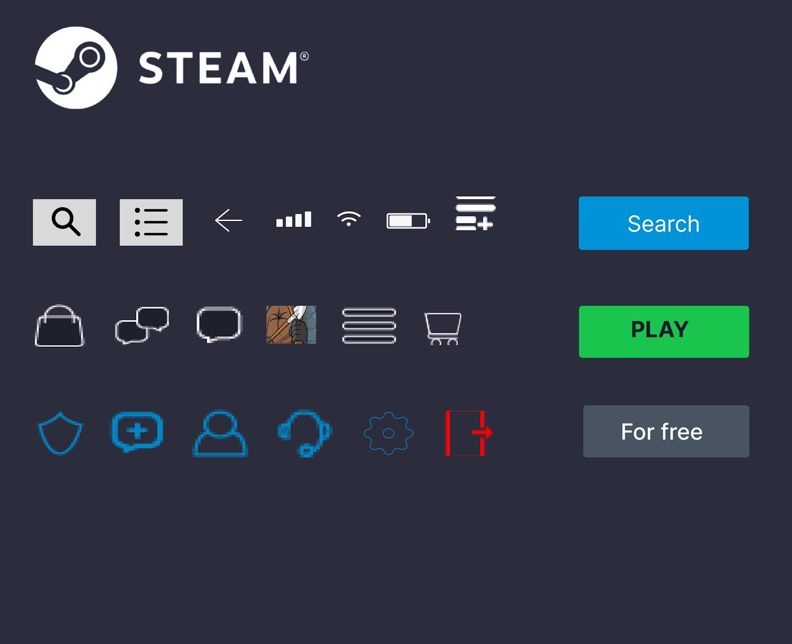 Fig 1.4 Iconography
As for the icons I did most of it myself in Adobe Illustrator as shown on the right image in Fig 1.4 only the status bar and steam logo is found on google and figma. Other icons that are not shown in illustrator are created in figma.
So before starting with the wireframe in figma I watched a few videos
that Mr. Zeon provided us in the weekly slides, and got to learn some
new skills on how to do the horizontal and vertical scrolling for the
prototype.
Fig 1.5 Figma UX tutorial for Beginners
So after watching the video I didn't really thought on how I can improve
my wireframes I just continued with what I'm doing and finished up my
flow 1.
.png)
Fig 1.6 Log in & Bio metric
.png)
Fig 1.7 Chat, Notification and Profile
.png)
Fig 1.8 Home, search and purchase
So after everything is more or less done I linked them all together so
that it can be tested as a interactive low fid prototype. It might look
and sound easy but it was actually a pretty tedious process due to the
linking of every buttons and action and also due to our heavy semester
this time it took out a lot of my energy.
.png)
Fig 1.9 User testing flow 1
When the wireframe prototype is done setting up, I continued on to the
nest stage which is usability testing. So we are tasked to do at least 3
usability testing and improve our lo-fi based on the feedbacks and what
we observe during the process.
Flow 1-
So in flow 1 the user is asked to log in the into the application go to
the home page and go to the bio-metric log in then back to the home page
basically as easy as that and after trying the flows we got back out to
figma and I asked him to check on the other flows there and asked for
his feedback. The feedbacks are as shown below.
Fig 1.10 Flow 1 Walkthrough

Fig 2.0 Flow 1 Prototype
.png)
Fig 2.1 Flow 1 feedback
As mentioned in the feedback the size of the wireframe is not set to the
prototype setting making the walkthrough difficult for the user and the
user also pointed out on what pages I can add on to make the flow more
smooth and usable.
Flow 2-
In Flow 2 user is asked to go through a buying phase until he reaches
the success page which will be around 9 steps that is needed for him to
go through. In flow 2 I've also resized the prototype to suit the phones
sizing so that the users have no need to move the screens around other
then the cotent.
Fig 2.2 Flow 2 Walkthrough

.png)
Fig 2.4 Flow 2 feedback
So after resizing the prototype user get to examine all the steps/page
more clearly and this user provided me suggestions on including the
descriptions and stuff in the buying page and also adding in a add to
cart feature for that most of his suggestions are to improve the buying
page like adding add to wishlist, game recommendations and also game
descriptions and also improve the whole layout of the home page as it
looks too simple right now.
Flow 3-
In Flow 3 is my final lo-fi prototype as I did flow 3 after having
consultation with Mr. Zeon. Sir also mentioned that I'm missing
onboarding page so I added in onboarding page for this lofi as well. In
flow 3 the user will go through all the onboarding page then the log in
and get to the profile page and change to activity and after that go to
the personal settings get back to the original profile page and go to
the library and choose one game to play then go back to home. This is
the whole journey of flow 3.
Fig 2.5 Flow 3 Walkthrough

Fig 2.6 Flow 3 Prototype
.png)
Fig 2.7 Flow 3 feedback
In flow 3 I basically changed the whole game description page and home
page also added in few new pages so that my prototype consist of what
the original steam mobile app have. I've also changed the layout into
something more interesting. So after getting feedback from user 2, it
came to my sense that the videos Mr. Zeon shared with us is the very
solution to that problem so I added in more content into the home
page, game description pages and etc. But as there's too much to show,
so in order to make the layout better and organized I looked back to
the videos sir shared and solved the problem with the scrolling
elements.
Link to Figma Lo-Fi File:
https://www.figma.com/design/FRmB2jK3hGf8bRS9lQraiS/APP-DES-RE?node-id=0-1&t=T64vGZOWWHRFLjKY-1
REFLECTION
So my experience in this is not very good due to the tedious semester having Experiential, Game Development, Minor project and Application Design all together almost killed me. But I don't really hate app des actually it's the other way around I think I leaned a lot in app des comparing to the other modules and I kinda enjoy doing the lo-fi too I also got to learn new skills and further discovering what Figma is really capable of overall App des is fun !


Comments
Post a Comment