Michael Chan Henn Loong (0363611) Task 1 (Exploration)
08.02.2024 - 22.02.2024 / Week 1 - Week 3
Michael Chan Henn Loong / 0363611
Design Principles / BA of Design (HONS) in Creative Media / Taylor's
University
Task 1 / Exploration
LECTURES
Design Principles :
Gestalt Theory
-Gestalt = Shapes or form in German
-Rule that shows us how our eyes perceives visual elements
-Transforms hard visual into something more simplified
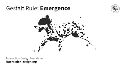
Fig 1.0 Gestalt Theory: Emergence
Emergence: Rather than diagnosing each dots or blotch separately,
identifying a dalmatian dog from the oddly placed and shapes of black
dots. In other terms, it means that stuff can emerge from seemingly random
scenes.

Fig 1.1 Gestalt Theory: Closure

Closure: Gaps are automatically filled between gaps of
elements to retrieve a complete image. For an example
Fig 1.2

Fig 1.3 Gestalt Theory: Common Region
Common Region: Elements that are enclosed in the same
containers are usually perceived as the same group. To apply this
rule, group up elements with same purpose or meaning together in a
container to show the separation with different groups.

Fig 1.4 Gestalt Theory: Continuity
Continuity: In Continuity elements that are following a
particular direction will be grouped together.

Fig 1.5 Gestalt Theory: Proximity
Proximity: When elements are grouped together and separated
further from other elements, they will be seen as one distinct
entity.

Fig 1.6 Gestalt Theory: Multistability
Multistability: This theory is the perceptual experience
of changing back and forth between two or more alternative
interpretations.

Fig 1.7 Gestalt Theory: Figure/Ground
Figure/Ground: Instinctively objects are perceived to
either be in the foreground or background.

Fig 1.8 Gestalt Theory: Invariance
Invariance: The ability of vision to identify basic geometric objects
without regard to scale, translation, or rotation.

Fig 1.9 Gestalt Theory: Pragnanz
Pragnanz: When faced with a collection of unclear or intricate
items, your brain will try to simplify them as much as it
can.

Similarity: Similar elements are grouped together.

Symmetry & Order: Human mind are satisfied with symmetry or order and automatically
interprets items as being symmetrical.

Common Fate: Elements that move simultaneously are interpreted as a part of
the same group as opposed to other screen components that
move or remain stationary.

Fig 2.0 Contrast
Contrast
-Juxtaposotion of strongly dissimilar elements
-Color, shapes or even lights can create contrasts
-Content without contrasts can be boring
-Contrasts emphasizes some point of the work.

Fig 3.0 Emphasis
Emphasis
-This design principle uses highlighting a certain element within the design
to make them stand out from the work and to catch others eyes.
-Emphasis can be achieved through various ways such as color, size, shape,
placement etc.
-Helps guiding viewers focus and creating hierarchy within design.

Fig 4.0 Balance
Balance
-This design principle uses visual weight evenly throughout the composition
to create a sense of stability and harmony.
-There are two parts for this design principle, Symmetrical Balance and
Asymmetrical balance.
-Symmetrical Balance, elements are evenly arranged by surrounding the
central axis.
-Asymmetrical Balance, different kinds of elements balanced through with
contrast and placements.
-Balance makes sure that there are no overlapping or overwhelming in the
work.

Fig 5.0 Repetition
Repetition
-This design principle involves with using elements like shapes, colors or
patterns throughout the whole composition to create a sense of unity and
consistency as the elements are repeating.
-Repetition helps create a sense of rhythm and also magnifies the key visual
elements too.

Fig 6.0 Movement
Movement
-This design principle creates a illusion of motions or progression within a
composition.
-It guides the viewers eyes throughout the whole work with elements such as
lines, shapes and visual flow.
-This principle can be achieved with the uses of diagonal lines, overlapping
elements, or strategic placements of elements.

Fig 7.0 Harmony & Unity
Harmony & Unity
-This design principle involve creating a sense of cohesion and completeness
within a composition.
-Harmony refers to the success combination of different elements such as
colors, shapes and textures which works together to create a pleasing
overall result.
-Unity refers to the cohesiveness of the elements throughout the whole
artwork.

Fig 8.0 Symbol
Symbol
-This design principle uses visual elements to represent abstract ideas,
concepts or body.
-Could be simple or complex as they usually carries different cultural or
universal meanings with them which allows viewers to quickly understand the
messages that are tryin to be conveyed.

Fig 9.0 Word & Image
Word & Image
-This design principle combines visuals and words together in order to
convey a message or to bring out a story.
INSTRUCTIONS
<iframe
src="https://drive.google.com/file/d/1h3Xcxt8czzs2ii5dEThzihvAUo_pJXR8/preview"
width="640" height="480" allow="autoplay"></iframe>
Task 1: Exploration
UNSDG 15 : Life On Land

( Fig 10.0, https://jointsdgfund.org/sustainable-development-goals/goal-15-life-land )
UNSDG 15 means United Nations Sustainable Development Goal 15 also knows as
UNSDG 15 Life On Land. This articular UNSDG works to protect, restore or
conserve the use of ecosystems and promotes the use of terrestrial ecosystem.
So in short this works to make sure that the ecosystem is healthy and also to
support all the life on land.
Selected Existing Work-

( Fig 11.0, Nature's Magical Moment, Julian Rad, 2015, Photograph,
https://www.boredpanda.com/photography-austrian-wildlife-animals-julian-rad-part-2/?media_id=2774036&utm_source=pinterest&utm_medium=social&utm_campaign=organic)
Reason
-The reason I chose Julian Rad Photography due to its connection with the
UNSDG that I chose which is UNSDG 15:Life on Land which aims to protect,
reserve and promote sustainable use of ecosystems. I think that Rad's
photography captures the very beauty and wonder of the natural world which
also serves as a reminder of the importance on preserving and protecting our
very own world.
Design Principles
-In this photograph I see Balance and Emphasis. There are elements like the
flower and the squirrel in it that are emphasized to create a kind of
attraction for the viewers attention and its also positioned against the green
contrasting background. As for Balance I think everything is just fine at its
current position no over lapping no extra elements, I think the visual weight
are evenly distributed in this photograph.
FEEDBACK
Week 1- Introduction to Design Principles.
Week 2- Absent due to Chinese New Year.
Week 3- Have planning for the photoshoot, taking pictures normally without
statements are not artwork.


Comments
Post a Comment